Use your widget sidebars in the admin Design tab to change this little blurb here. Add the text widget to the Blurb Sidebar!
Posted: March 20th, 2012 | Author: Julie Rutherford | Filed under: Events | No Comments »
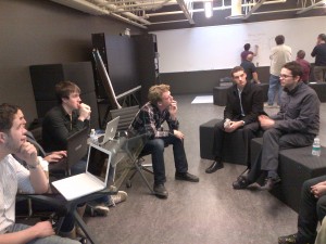
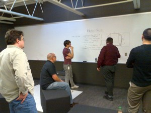
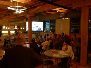
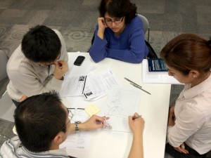
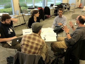
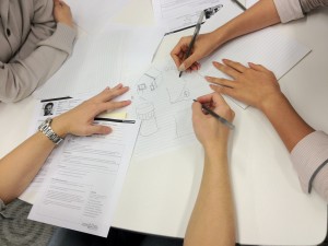
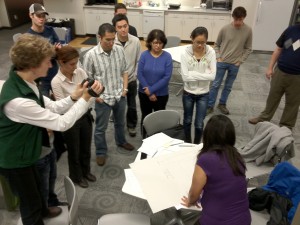
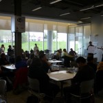
In our March event at the FELT lab, uxWaterloo members gave our feedback to the students from the Research Entrepreneurship Acceleration Program (REAP) at the University of Waterloo. We listened to quick presentations from each group, and then broke into groups so we could chat more about the usability issues and concerns that they were having in their projects. Thanks to the students for showing us their ideas and allowing us to share our usability expertise!
Our next event in April will give us another chance to provide feedback and apply our usability knowledge. This time, we’ll be having a workshop, where we’re helping a not-for-profit group by providing ideas for their mobile app. Stay tuned fore more!
March 2012 REAP Student Project Highlights

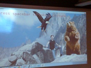
Video Wall– This group was able to film someone and make them look like they were part of an image on a screen. They were able to gather great ideas about how this could be used in shopping malls and other public spaces. Their main challenge was how to go from fun to getting a message through to the public.

iPad app for Thinkering– Their iPad app can be used for brainstorming sessions, or thinkering, where groups may want to have one person recording their session. The app creates a cloud of tags that will become searchable. We brainstormed lots of other day-to-day uses for the app, provided some interaction design suggestions, and came up with ideas for more integration with other devices.

Blister Games- This group has the challenge of taking a boardgame, digitizing it, and making it available on mobile devices. We were able to suggest ways that they could use of negative space to their advantage, and also provide zoom in/out options that could help players keep track of their moves, and the full board.
Posted: January 24th, 2012 | Author: Julie Rutherford | Filed under: Events | No Comments »
Whitney Quesenbery (@whitneyq) and Daniel Szuc (@dszuc) were our special guests who called into last week’s uxWaterloo meeting by video conference. They are the authors of Global UX, which describes their in-depth interviews with design professionals who represent over 60 countries and 25 languages. Check out the following highlights from their presentation, and thanks again to Whitney and Daniel for joining us!
Are there tips that ux professionals can use when running global usability tests?
When conducting usability tests, let your testers talk to you about what they do. Acknowledge who they are in their world and change your testing methods to suit them. Plan breaks between global usability tests and give yourself more time after sessions for debriefing, to ensure that you’ve absorbed the information from the meeting. Overall, don’t think of people as your usability testers. Instead, think of them as your global collaborators.
From your interviews, what were the most common characteristics of people working in global ux?
The common characteristics were openness, curiosity, and a willingness to learn about other cultures. More details about these and other characteristics are available in this article: Global UX: A Journey.
What tips do you have for project teams wanting to improve in global ux?
Create a mindset in your project team where team members care enough to ask how to make a product more global. Have a cultural debrief at the beginning of a project where you ask “what are the things that we assume and could constrain our project team’s thinking?” Each team member should ask themselves “who do I need to speak to to help me learn and confirm what I know and don’t know?”
What can I do to improve how I work on global ux projects?
If you need to research a group of users you don’t know about, spend time with them. Immerse yourself in their world for a little while to understand the services they use and understand how they interact with others. Furthermore, get out of the office and watch people using your products! You don’t necessarily need to travel widely to gather a global perspective and you can learn a lot by calling your global coworkers to ask for their perspective. If you do decide to travel, have a local buddy that can answer your questions and help you with your travel plans. Involve them in your usability tests and get their opinions in your debrief sessions. They can help you understand any cultural or language differences that you may encounter.
Posted: December 23rd, 2011 | Author: Julie Rutherford | Filed under: Events | No Comments »
Our December “Show and Tell” was a great way to close out 2011 and learn about what others have been working on!
Mark gave us more insight into how he has designed an application that displays connections between medical facilities.
Chris provided an update about the volunteering he is doing with REEP. This was great to hear, as there are a number of uxWaterloo volunteers helping REEP and continuing the design discussions that we had in our October event.
David explained how he created a solution that allows product designers to share feedback on their designs through an intranet. It was great to see such a collaborative approach to wireframing!
James demoed a tool that is helping designers put their wireframes in a development-friendly format.
Artem has been working on a BlackBerry Messenger (BBM) game that allows users to use their chat session as a game and place votes to play the game.
Bob took us through a new venture that he’s working on, where he’s able to provide design thinking into the business plan and strategy.
It was great to hear about such a large variety of projects and we look forward to other show and tell events in the new year. Thanks to everyone for making our 2011 uxWaterloo events so interesting and insightful! All the best to you over the holidays and stay tuned to our uxWaterloo blog and @uxWat feed on Twitter for news about our 2012 events!
Posted: December 5th, 2011 | Author: Julie Rutherford | Filed under: Events | Tags: event, show-and-tell, wireframes | No Comments »

Tuesday Dec 20, 2010
5:30 to 7:00 pm + Join us for drinks afterwards
Pollock Executive Briefing Centre at The Communitech Hub
151 Charles St. W., Suite 100 (Tannery Building) in Kitchener
[Map
Show off your work or your tools this winter!
What are you working on before the holidays? Come share with us at this month’s UX Show and Tell event! Bring examples of anything from your work: research artifacts, personas, sketches, wireframes, design comps, prototypes, documents… anything goes. Even show off a favorite tool, if you’d like. Tell us about a challenge you faced, explain a problem that you solved, or simply share something you’re proud of.
Tips for presenting
Prepare to make your presentation brief, to allow time for questions and discussion. And importantly, please be aware of our 3 golden rules:
- No sales pitches
- Anchor your demo in design/UX (e.g., a code review wouldn’t be appropriate for this event)
- Choose only one or two pages from that 5-pound design specification
A projector, laptop (Macintosh), and Internet connection will be available. If you can present from our laptop, that would help the evening progress more smoothly. But feel free to use your own computer if necessary.
Do I NEED to bring something to show?
No, it’s not required that you bring something to show. But we certainly encourage you do so, as you’ll be surprised how much fun it can be. Remember, you don’t have to show a lot. Even a single screenshot can be plenty. And yes, you DO have something that others would find interesting or valuable!
Mix and mingle afterwards
After the event ends at 7:00, we’re planning to get together at a nearby pub or restaurant. If some informal chitchat over a drink and food sounds like fun, please just hang out for a few minutes afterwards while we see who’s interested and decide where to go.
Posted: November 27th, 2011 | Author: Julie Rutherford | Filed under: Events | Tags: gestural interfaces, user experience, workshop | 1 Comment »
On Thursday, uxWaterloo had the privilege of being one of the first groups to tour the new FELT lab. We got a chance to practice “thinkering,” which happens when you tinker with technologies and think about how they can be applied to your daily life.
Our evening began with an introduction from students from the University of Waterloo’s Research Entrepreneurship Acceleration Program (REAP). Our challenge was to get together in groups, and brainstorm ways that we could combine the various technologies in the lab with a tool called Apptui.
Please click on the photo below to see a photo slideshow and the various technologies that we were able to play with. Thanks to REAP, Quarry Integrated Communications, and everyone who attended for such a fun and collaborative event!

Posted: October 25th, 2011 | Author: Julie Rutherford | Filed under: Events | 1 Comment »
In our October uxWaterloo meeting, we worked in groups to brainstorm ideas to improve the usability of the Green Home Planner, which is an online tool made by the Residential Energy Efficiency Program (REEP). REEP is an environmental, charitable organization that has provided home energy evaluations in Waterloo Region since 1999.
In the workshop, we got an overview of the company, the product, and the personas of the customers who use the Green Home Planner. This tool is used by home owners to plan upgrades based on REEP’s audit of their home’s environmental performance.
After brainstorming in our groups, each group presented and showed their design mockups. Overall, we agreed on the following tips to improve the user experience of this product:
- Provide immediate feedback – Allow users to get a updates right away by showing them results on the same screen as where they entered information
- Make the site fun and engaging – Motivate the user to complete their information, involve elements of gaming, and allow sharing with social media
- Remove barriers to entry – Do not ask a user to register immediately and let them explore
- Convey information with images – Allow someone to build their own virtual house and use graphs or meters to view savings and efficiency levels
- Use easy input options – Allow users to connect to local providers through postal codes and auto entry of bills
Thanks to all of our workshop participants for bringing their innovative ideas and to REEP for providing us with an excellent design challenge!


Posted: July 6th, 2011 | Author: Julie Rutherford | Filed under: Events | No Comments »
In our June event, the uxWaterloo group had Bob Rushby speak about Digital Light. From the Google office in Kitchener, Bob took us through the concepts that are possible when pixels are everywhere! Digital Light is a vision of the future, where the entire world becomes a canvas for expression.
Five years from now, Bob predicts that lighting will be transformed. Lighting will no longer simply illuminate, but it will be turned into cheap pixels. Pixels have already been used so you can dial from a keyboard that is projected onto your hand, doctors can see the veins of a patient, and customers can order from menus that look like they are part of the table they are sitting at! Bob really showed us through his examples that the possibilities are endless and you can let your imagination run wild. Check out the videos on the Baanto website to see how they have used pixels to allow multiple users interact with the same display and use this interaction with pixels as a social opportunity.
“Twists and Turns” on the Uniqa Tower, Vienna
The Uniqa Tower is a great example of how architecture can be used as art and signage. Take a look at this video, where it looks like the tower itself is bending and turning.
Find out more about Digital Light!
Thanks again to Bob for sharing his thoughts and ideas with us. Bob retired from Christie Digital Systems Canada Inc. in February 2011 after an exciting career leading talented teams in the creation of ground-breaking high technology products. Christie is a global leader in projection and electronic display products and has the world’s largest installed base of digital cinema projection systems. Bob is currently involved with several exciting university entrepreneurship initiatives — in particular, the University of Waterloo REAP program and the Ryerson University Digital Media Zone. He is also writing a book on the theme of Digital Light… pixels everywhere. To find out more, please contact Bob or check out the following sites.
Posted: June 8th, 2011 | Author: Julie Rutherford | Filed under: Events | No Comments »
In our May uxWaterloo event, Simon Woodside shared the “single screen” approach that he’s used at Monolith Interactive when building iOS products. He believes that your users will thank you for using a single screen approach, as they will find it more discoverable and that all objects will be easily related to each other. Popovers are useful in designs that use a single screen approach. A popover will allow for the rest of the screen to be used, even while it is open.
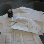
During the hands-on workshop portion of this event, we received client specifications for an iPad application. We worked in groups to come up with a single screen solution that would meet the client’s needs. When our groups showed our wireframes and talked through our designs, we were impressed by the many different ways each group interpreted the specifications! Then, seeing how Simon’s team designed their solution truly showed how a single screen approach can work effectively, on both mobile or tablet applications.
Thanks to Simon for sharing with our group and facilitating this fun and informative workshop!
Remember that our June event, “Pixels Everywhere!” by Bob Rushby, has been moved to the Google office.
Hope to see you there next week!
Next event- Pixels Everywhere– Thursday June 16, 2010
5:30 to 7:00 pm
Google Waterloo
151 Charles Street West, Suite 200
Kitchener, ONT
-

-
Workshop wireframes
-

-
May Event Workshop
-

-
Simon Woodside
Posted: April 19th, 2011 | Author: Julie Rutherford | Filed under: Events | No Comments »
In our March 7 Minute Soapbox event, we had uxWaterloo members share their ideas in an open format! The only catch was that they had 7 minutes on the podium. Our volunteers braved this challenge and shared some great insights with our group! Notes from each session have been posted below and thank you to all of our volunteers for sharing their ideas.
We hope to see you at tonight’s uxWaterloo event, where Tammy teWinkel shares her insights from working in usability at RIM! For more information about tonight’s event and to register, please visit: Confessions of a qualitative girl in a quant-filled world at RIM.
Mark Connolly
Mark shared information about the usefulness of realistic data in UI mockups. He explained that the right time to move away from fake to realistic data in your designs all depends on the project and the audience. Sometimes you move onto realistic data early on, to get more feedback from users in testing. But, be aware that there is some overhead with doing realistic mockups in HTML, CSS and JavaScript.
Sandra Loop
Sandra showed us how she has used PowerPoint to explain concepts. This has been a useful technique for her, as it’s very easy to share files with team members and it is a fast way to explain a concept to a development team. She proved that the animations that are built in with PowerPoint allow you to explore a new or unusual design problem and to work on showing possible alternatives.
Karen Cecile
Karen shared a story about her parents’ adventures with technology. She emphasized that when designing for the general market, we should always keep seniors in mind. Seniors often have unique needs and conducting a quick interview may help you quickly understand ways to tailor a product or design to them.
Tom Robinson
Tom shared his journey through his personal experiences in usability. He explained that during school, he focused on development. As he worked in various positions and throughout grad school, the purpose of usability became clearer and he gravitated toward a user-centered approach. While discussing, the group agreed with Tom and thought that having usability courses available in design/development course curricula would help promote usability.
Robert Barlow-Busch
Bob based his talk off of Jane McGonigal’s book, “Reality is Broken: Why Games Make Us Better and How They Can Change the World.” This book outlines that real life can be changed into games. For example, Prius has a fuel monitor that shows your fuel economy. People change their driving behaviour and become better drivers because of this game. Other examples of games are Runkeeper, which changes running into a game, and Chore Wars, which turns chores into quests. Overall, we should consider how games motivate us and can help us become better people!
Maryam Ashoor
Maryam let us know that when she was visiting the Google China site, she found that she could no longer navigate back to the www.google.com site. She also mentioned that you should test to see if your webpages are translated by search engines. You should take cultural factors like colours and text into consideration when building a webpage that will be globally accessible.
Posted: March 23rd, 2011 | Author: Julie Rutherford | Filed under: Events | No Comments »
uxWaterloo’s very own Robert Barlow-Busch is going to be speaking at next week’s Design Meets Efficiency in Waterloo Mixer!
Pivot Design Group is hosting this event and it will be a great chance to discuss discuss how we as designers can really begin to think about designing more efficiently. Network among colleagues and friends in the Waterloo area and share in open discussions with industry professionals. With 5 ideas and 5 images, prominent, local speakers will discuss the idea of Efficiency in Design as it relates to design in the 2010’s.
Please check out the details for this event and we hope to see you there!
List of speakers & Registration: http://designmeetsefficiency.eventbrite.com/
When: Wednesday, March 30, 5:30 pm – 7:30 pm
Where: Caesar Martini’s – 140 University Ave. W, Unit 1A, Waterloo, Ontario, Canada
