January Recap- Practical Advice for Accessible Design
Posted: February 23rd, 2011 | Author: Julie Rutherford | Filed under: Events | No Comments »Our February uxWaterloo event Designers designing research: what methods do you choose? is coming up tomorrow and we hope to see you there!
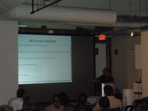
If you missed our January event, Ali Ghassemi and Dariusz Grabka of Desire2Learn hosted over 50 uxWaterloo members and shared their insights about accessible design. They shared their key formula with us, which was:
Accessible Design = Personal knowledge x thoughtful design x good technical implementation +/- magic
Now, getting your hands on some magic may prove to be difficult, but you can remember these key points to improve the accessibility of your designs.
1) Use different personas for each piece of hardware
Consider how your design will work for someone without a keyboard, mouse, monitor, or sound.
2) When designing for screen readers
Stay away from the cardinal sin of using “click here” links, as they will not provide any context to someone using a screenreader. Instead, include the name of the subject in the link (e.g. uxWaterloo February Event) and this will allow those using screenreaders to navigate the page and understand which links are about certain topics.
3) Design standards to consider
Keep your code clean, as page layout is very important for screenreaders. Remember to use inline headings in your CSS to help users with screenreaders understand what your page is about. Stay away from using tables as the layout of your page, as they are difficult to interpret on a screenreader. Ensure that images on your site have alternative text and captions, as captions will help your images appear in a search of the site. On a web form, you should ensure that your error pages do not require users to re-enter data, as this increases their effort.
4) Tips for developers
Developing with accessibility in mind can be tricky, so collaborate and quality test with other developers and designers. You can have alternative designs for users, to give them options. For example, a drag and drop design can also include checkboxes as an alternative. Off-screen CSS is also a simple way to provide information for screenreaders only. For example, when colour or images imply information on your site, you can use off-screen CSS to identify the colour or relay additional information.
5) Accessibility Resources
Derek Featherstone– Check out Derek’s web talks about accessible design.
@webaxe– Podcast & blog about web accessibility. Techniques, theory, news, events, and more!
Thanks again to Ali and Dariusz for hosting such a great event!


Leave a Reply