November Recap- Design at Google & RIM
Posted: December 4th, 2010 | Author: Julie Rutherford | Filed under: Events | No Comments »In November, our uxWaterloo group had the privilege of hosting two exciting events! We had a great turnout for both and everyone was interested to find out more about design & usability best practices at Google and RIM.
Event 1: Lessons from Designing at Google
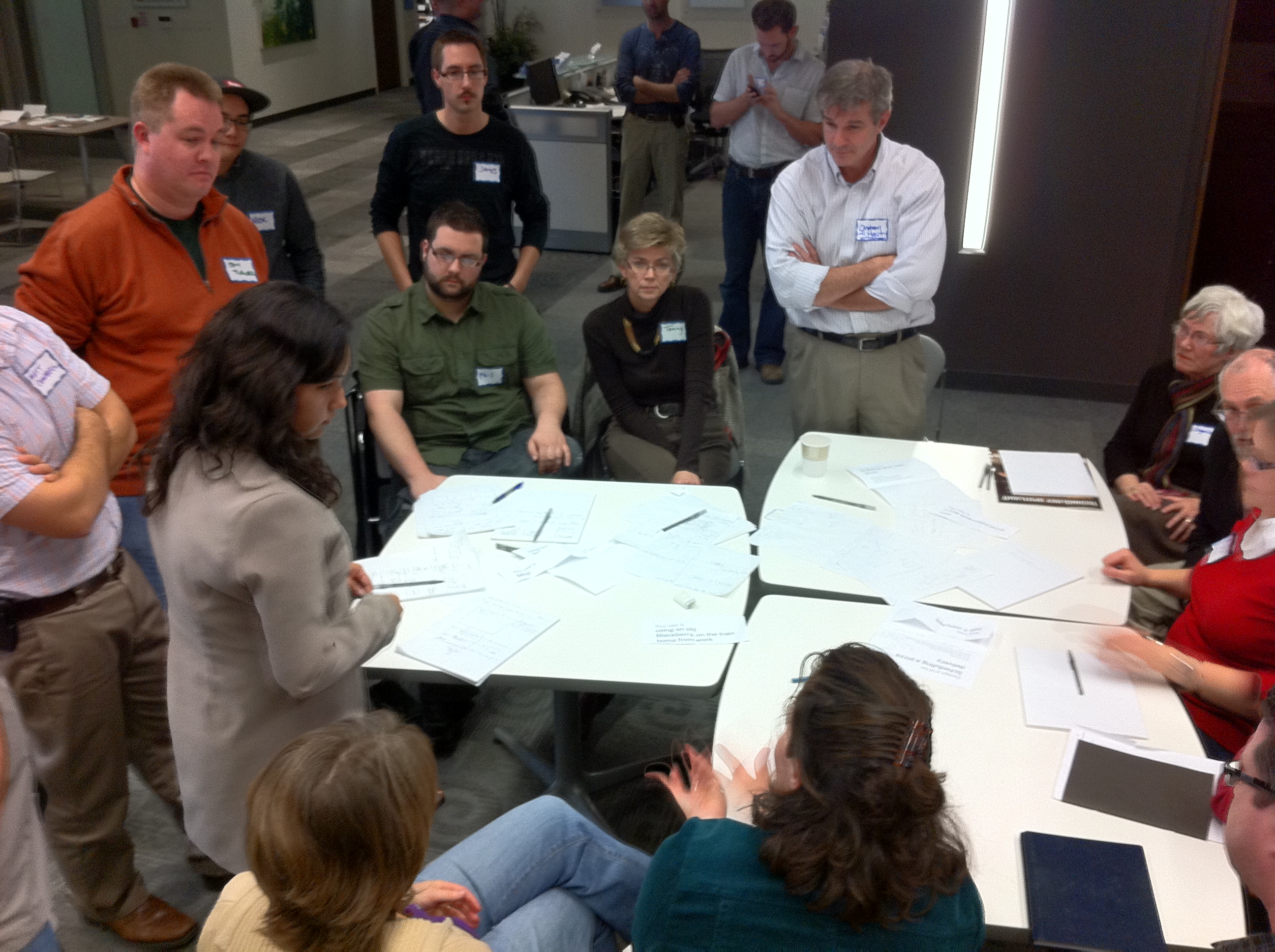
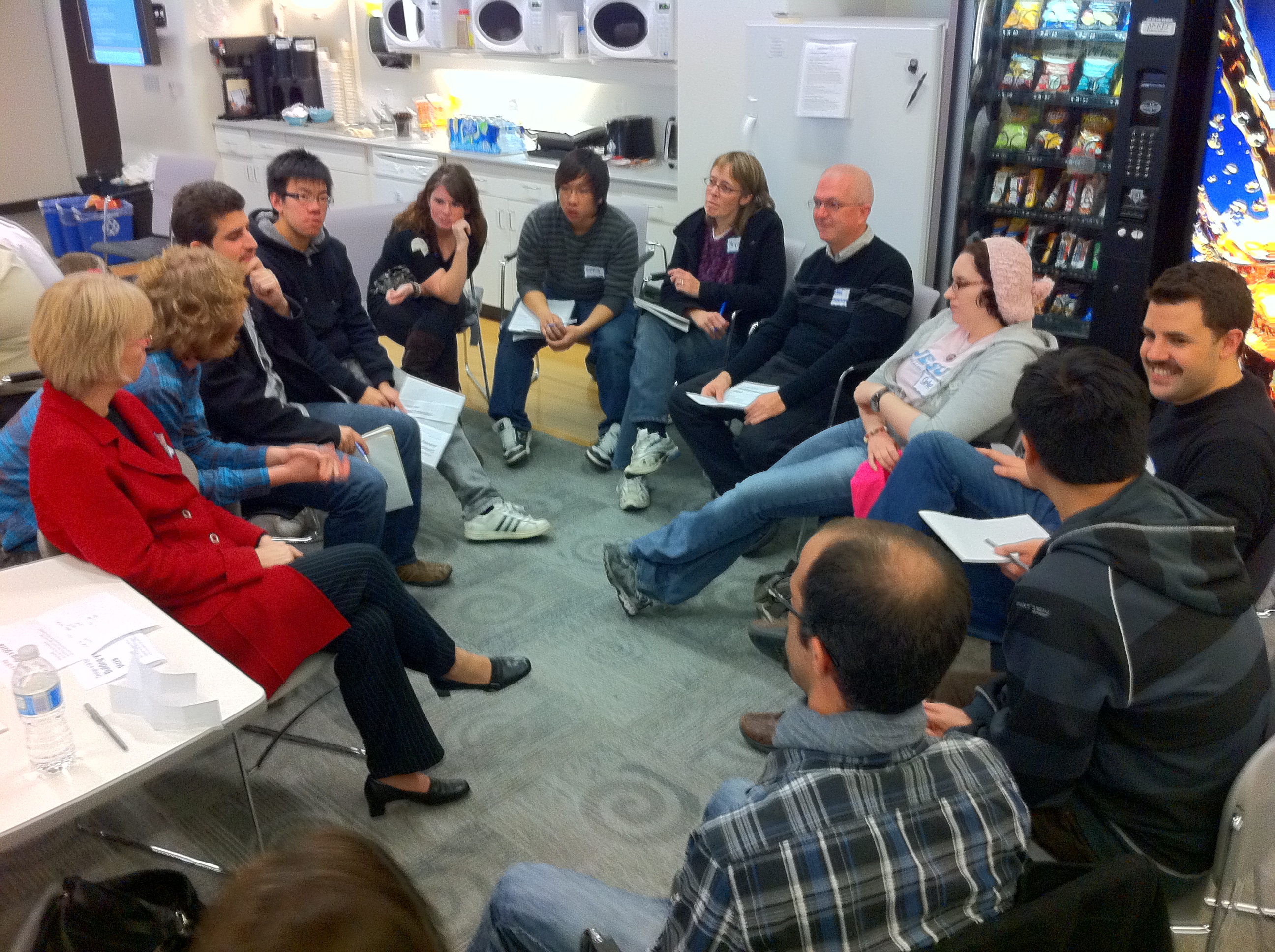
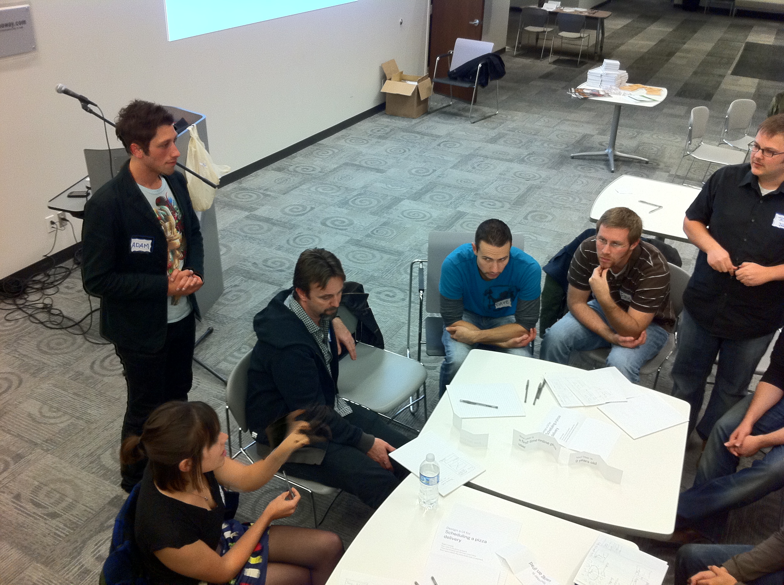
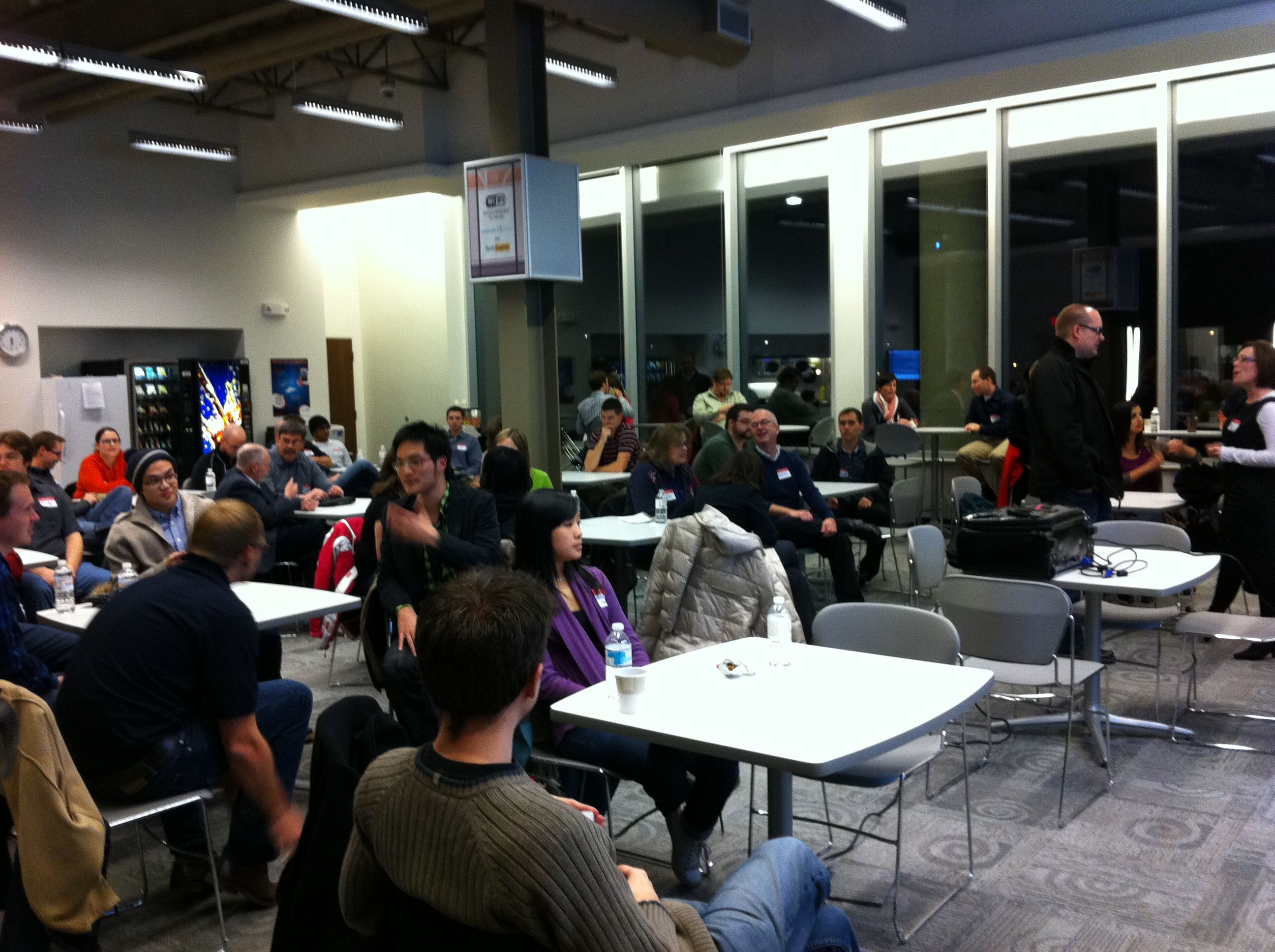
Adam Baker, a user interface designer at Google, kicked off his talk with us by splitting the room of about 68 people into groups of 4 per group. Each group picked from the “bucket of constraints” and discussed the design challenge they were given. After they found a solution, Adam merged each group with another, and asked them to incorporate all of the constraints that they were facing and design one joint product. For example, a group designing an iPad application that lets a user build their own pizza was merged with another group creating a mobile application for scheduling a pizza delivery. Then, when Adam asked the groups to merge again into groups of about 15 people, there were some really interesting combinations! One group found themselves designing a blind first time user of an old BlackBerry, with only two minutes on a train, who was trying to order 100 pizzas for 100 locations!
This exercise really showed the difficulties that are faced when designing for a product like Google Search, that is used by millions of people. Adam explained that each design team brings a different perspective to a problem, and it’s important to be open to new ideas. The analogy that Adam used to describe design at Google Search, is that it is like designing for the backcountry. He and his teams needed lightweight and multi-purpose usability testing tools that are adaptable to different users and situations. He also showed us that designing for search must be obvious and subtle, since minor changes greatly impact user happiness. Thanks to Adam for his sharing his informative talk and interactive activity with us!
Event 2: User Experience at Research In Motion
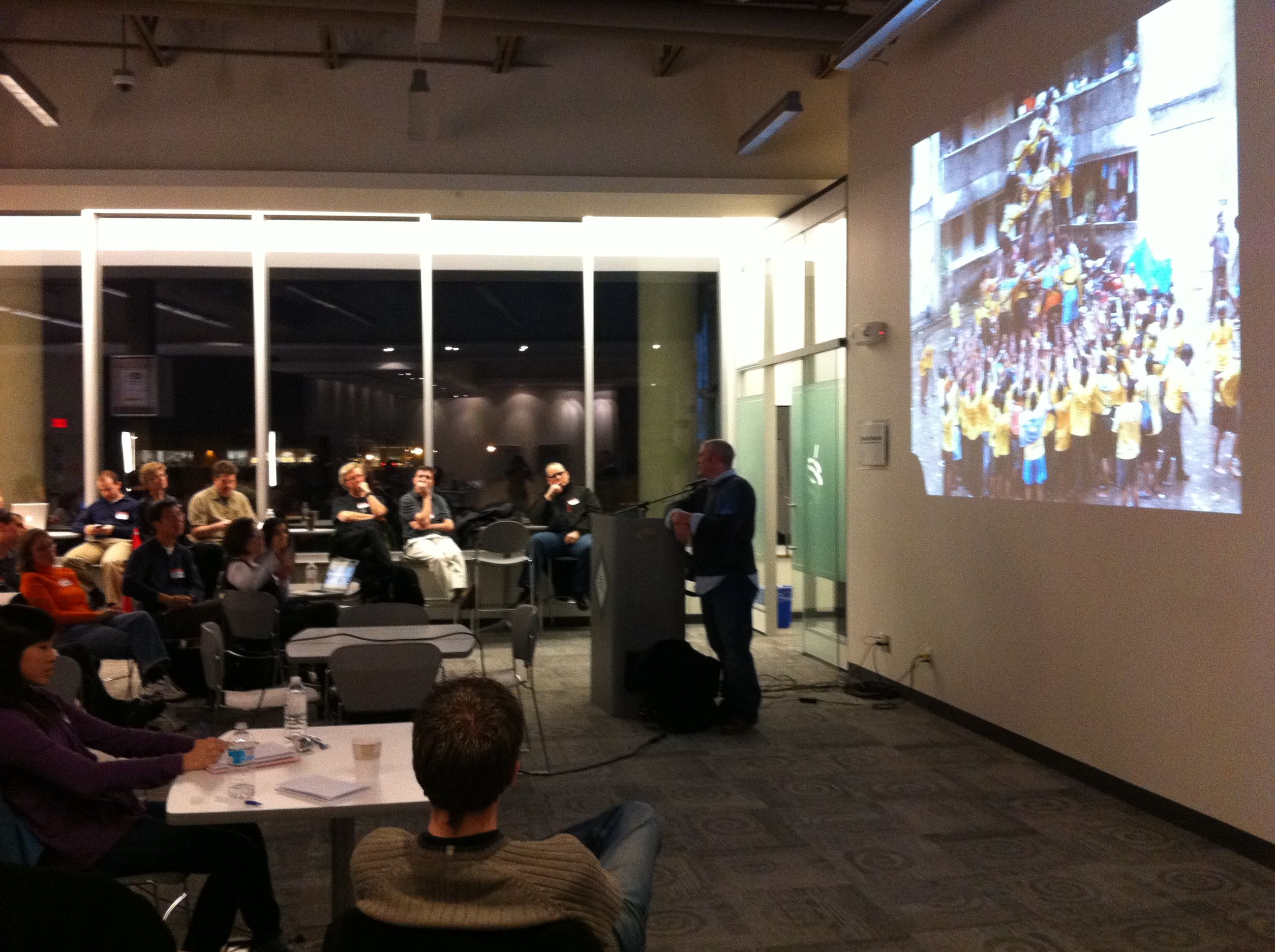
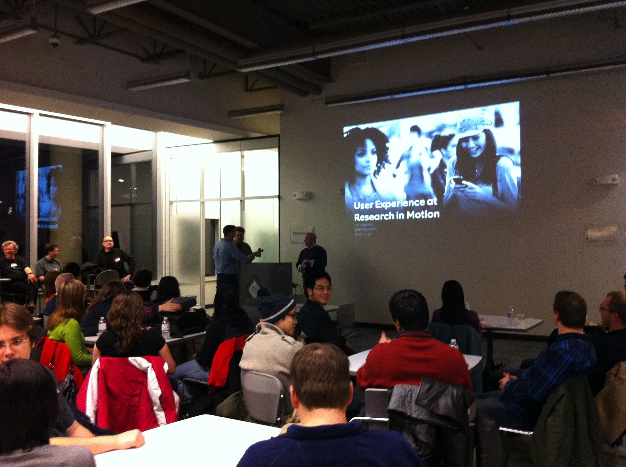
Our second speaker in November was Joey Benedek, the Director of User Experience Research at Research in Motion (RIM). His talk brought home the idea of what user experience is all about – “building an emotional experience around something“. His example of television poker brought home the idea that it is possible to take something mundane (strangers playing poker together), and wrap it in a story that suddenly makes it interesting and exciting. It becomes the responsibility of those in UX to find the right emotional experience and story to wrap around their product.
Joey then continued his talk by highlighting a number of different activities that were conducted by the UX research team at RIM for the BlackBerry 6 product.
- Ethnographic methods, specifically a diary study, were used to find out more about how people search for things in their everyday lives (not just with their smartphones). This directed the redesign of the search interface on the BlackBerry by highlighting the need for seamless integration with online searching, and the need for dynamically updating search results.
- Short A/B studies conducted using hundreds of reactions to 4 second flashes of two different UI aesthetics. The unique part of this study was to show different aesthetics that accentuated different variables, rather than presenting real interface concepts. The reaction to different emphasis helped to direct the aesthetic design of the BlackBerry. Joey also mentioned that it was critical in this aesthetic development to ensure that research didn’t get in the way of the creative process.
- Classic card sorts were used to redesign the options menu.
- Call centre data showed where people were dropping out of the initial setup process, inspiring a new setup screen that allows the user to complete setup activities for the features they wanted, and at any time. They also incorporated a video into the new intro that quickly shows the user how they can use the inputs (touch and keyboard) on the device to interact with the interface.
- A new graphical context menu was created to solve the issue of what to present in the initial menu brought up by the user.
- The browser was redesigned to play off the user’s predefined expectations of how browsers should function – tabs, location bar at the top, actions available at the top by the location bar, etc.
Along with his eye-opening talk, Joey answered a number of questions about UX research at RIM. He spoke about where ideas came from, how to deal with touch inputs, how to appeal to your loyal users while drawing in new users, and their philosophy on iconography and theme development. Thanks to Joey for showing us so much about how a large and successful company can integrate change and fresh UX ideas into their company!
Leave a Reply